Nemo Fintech Website & Dashboard
We had the opportunity to work on the design of the Nemo Fintech website and dashboard, aiming to create a visually appealing, informative, and user-friendly experience for visitors and users. The design of both the website and dashboard focused on consistency, clarity, and intuitive navigation, allowing users to easily access information, manage their finances, and make informed decisions.
Dashboard Design
2 months
Nemo

Introduction:
We had the opportunity to work on the design of the Nemo Fintech website and dashboard, aiming to create a visually appealing, informative, and user-friendly experience. The goal was to ensure consistency, clarity, and intuitive navigation, allowing users to seamlessly access financial information, manage their finances, and make informed decisions with ease.
The design approach was guided by Nemo’s vision of providing a personalized, interactive, and secure financial management platform. We focused on integrating customizable features, real-time updates, and dynamic data visualizations to enhance user engagement and efficiency.
Key Features:
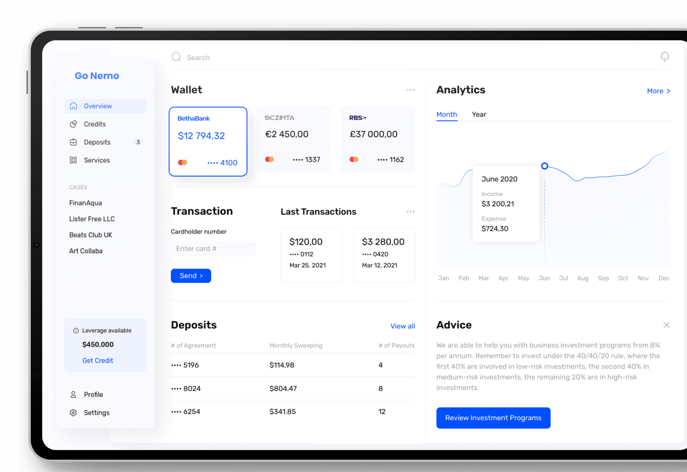
Customizable Widgets and personalization
Nemo's Customizable Widgets and Personalization options empower users to shape their online experience. Tailoring content, creating a unique interface, and personalize users journey to make the web truly work.
User-Centric Dashboard Layout
Nemo's User-Centric Dashboard Layout offers a host of features designed with users in mind. Enjoy intuitive navigation, personalized widgets, and easy customization for an unparalleled online experience.
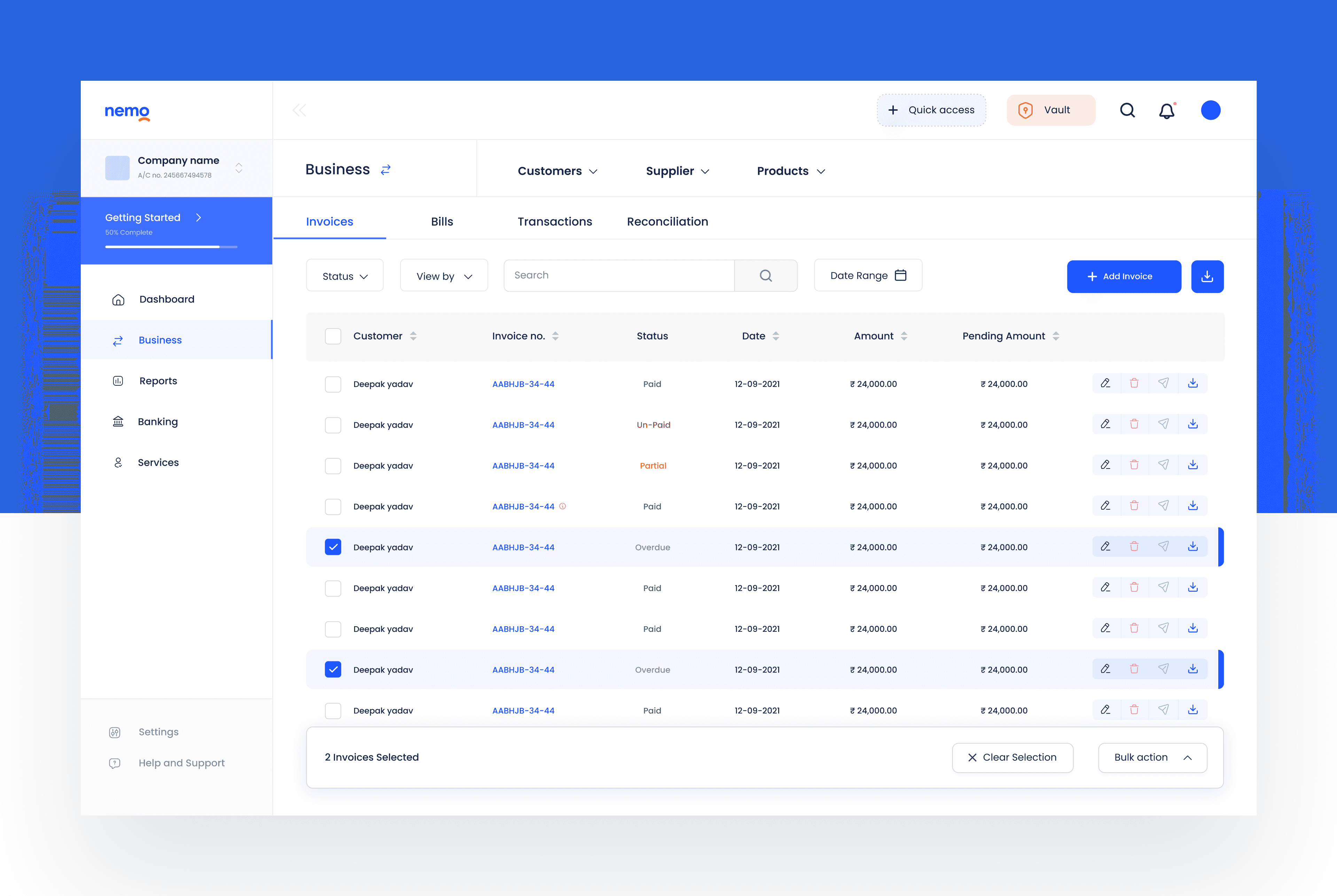
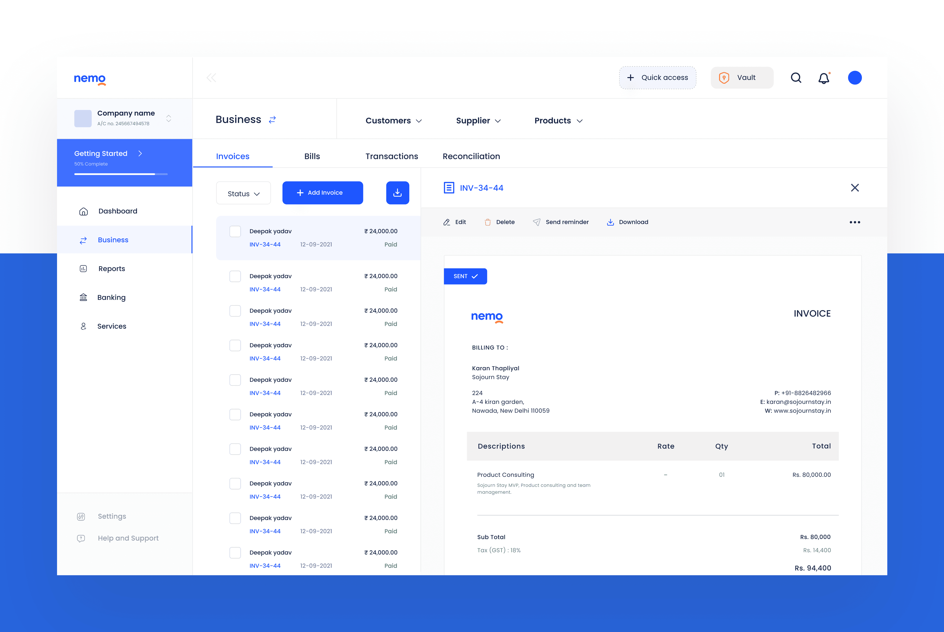
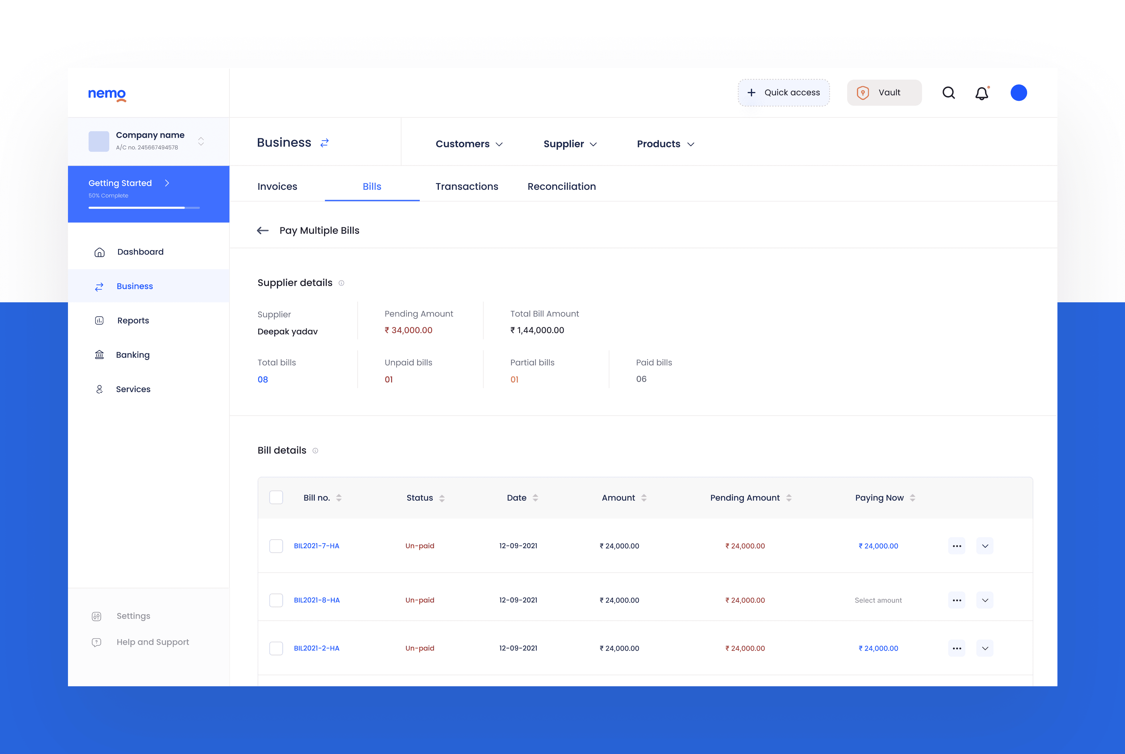
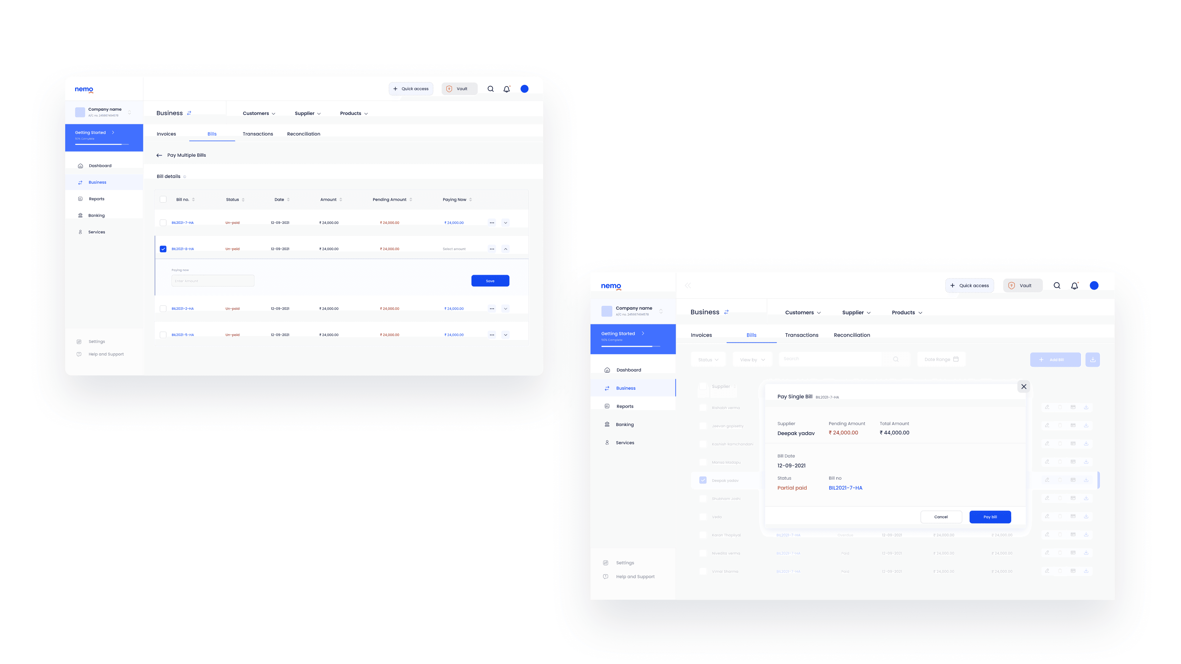
Effortless Navigation and Task Management
Nemo ensures effortless navigation, simplifying user tasks with an intuitive interface, streamlining the online experience.
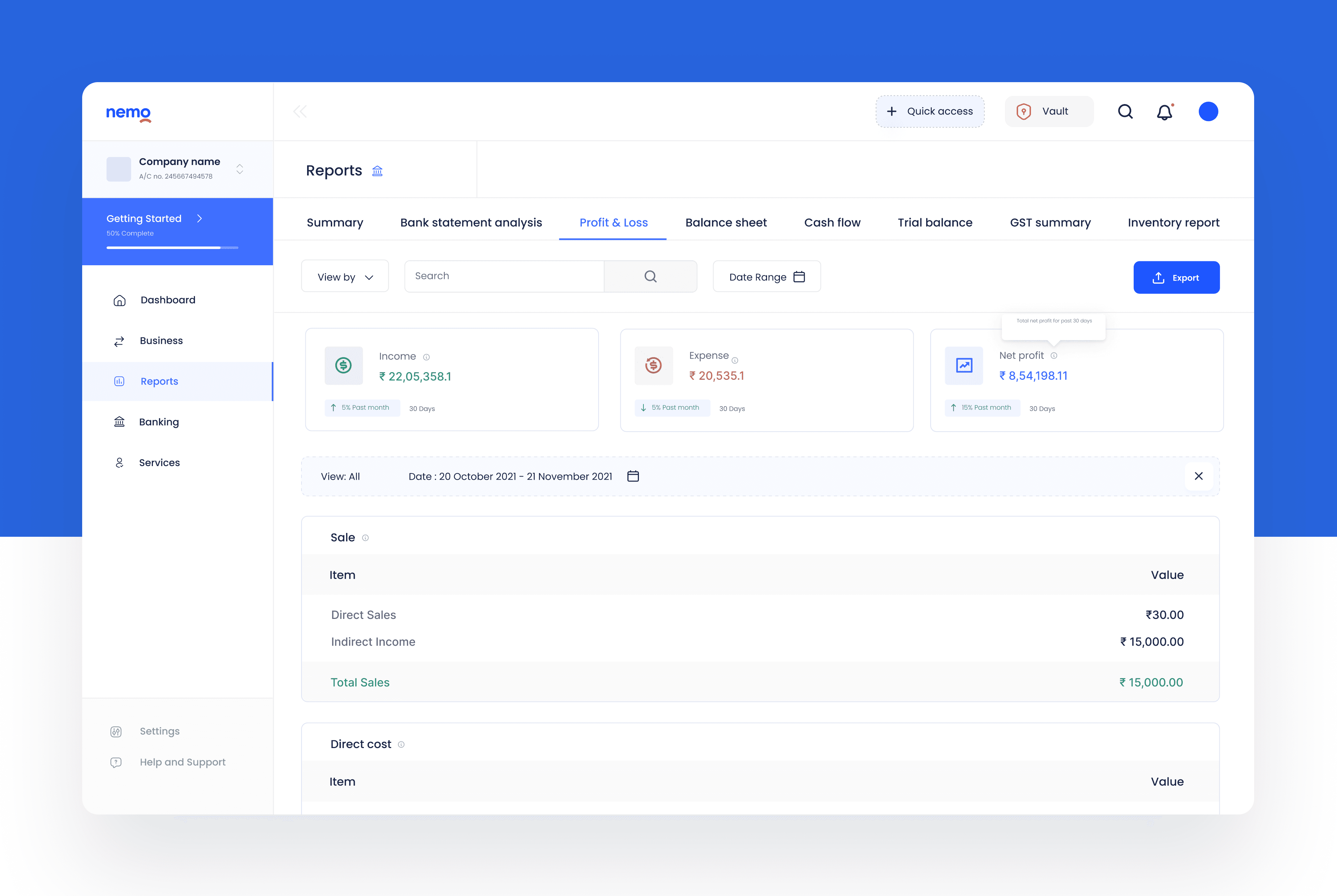
Interactive Charts and Graphs
Nemo's Interactive Charts and Graphs provide dynamic data visualizations at users fingertips. Explore trends, make data-driven decisions, and customize users graphs for a richer, interactive experience
Real time Notifications and Alerts
Nemo delivers real-time Notifications and Alerts, keeping users informed and engaged. Stay updated with instant notifications tailored to users preferences, ensuring users never miss important updates or events.
Data security and Privacy
Nemo prioritizes users data security and privacy with advanced encryption, strict access controls, and regular audits to ensure users information remains confidential and protected. Rest easy, knowing users online experience is safeguarded.
Design Considerations:
1. Brand Colors and Theme
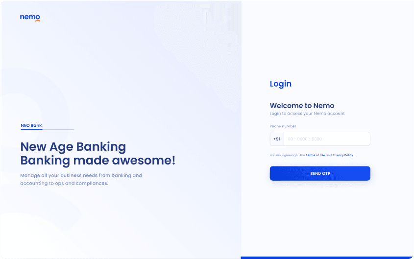
Primary Color: Blue (#3F6FFF) – Represents trust, professionalism, and stability.
Secondary Color: Orange – Adds vibrancy, energy, and a sense of innovation.
Dashboard Theme: White Mode – Ensures clarity and a clean, minimal look.
2. Typography
The design features Poppins font for a modern, minimal, and readable interface, ensuring users can easily interact with financial data without distractions.
3. User Experience Focus
Minimalist UI: Ensuring clean visuals without overwhelming users.
Consistent UI Elements: Keeping uniformity across the website and dashboard.
Optimized Spacing and Readability: Enhancing user engagement through well-structured content.
Final Design:
Conclusion:
Designing the Nemo Fintech website and dashboard was a project driven by the need for aesthetics, functionality, and security. Our approach ensured that users not only find the platform easy to navigate but also empowered to take control of their financial decisions with real-time data, intuitive design, and robust security measures. The final outcome is a platform that aligns with Nemo’s mission to deliver an innovative and seamless financial experience.
If you liked my dashboard designs, please let me know by contacting 😊
